Color is one of the most powerful elements in an artist’s toolkit. It has the ability to evoke emotions, shape perceptions, and drive purchasing decisions. In the realm of poster design—where visuals must quickly captivate and communicate—strategic color use can be the difference between a scroll-by and a sale.
For artists aiming to make an impression on platforms like Pixenva.com, understanding the psychology of color is not just beneficial—it’s essential. This guide explores how different colors impact viewers, how to use them to create mood and meaning, and practical tips to help your art connect, resonate, and sell.
The Psychology of Color: What Emotions Do Colors Evoke?
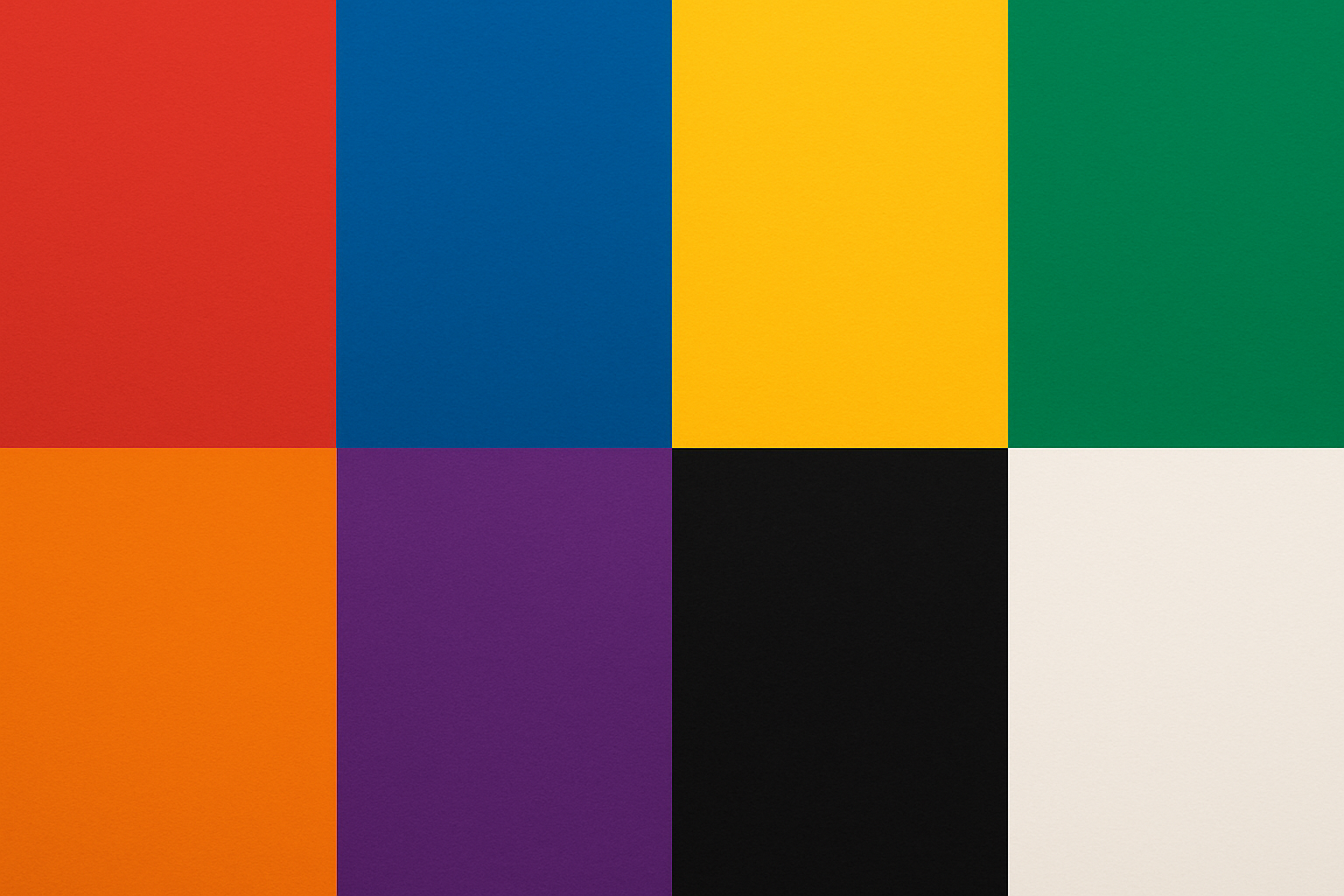
Every color carries emotional weight. When used with intention, color can set the tone of a piece and create a strong emotional connection. Here’s a quick breakdown of what common colors typically convey:
- Red – Passion, energy, excitement, danger. A bold, attention-grabbing color that demands to be seen.
- Blue – Calm, trust, peace, stability. Blue communicates reliability and is often associated with professionalism.
- Yellow – Happiness, optimism, creativity. A bright, uplifting color that injects positivity into any design.
- Green – Nature, growth, health, balance. Green is grounding and often linked to well-being and renewal.
- Orange – Enthusiasm, warmth, success. A fun, energetic hue that adds vibrancy and approachability.
- Purple – Luxury, wisdom, mystery. Purple often evokes sophistication and artistic flair.
- Black – Elegance, power, exclusivity. Perfect for creating contrast, drama, and a sleek aesthetic.
- White – Purity, simplicity, space. White offers breathing room and clarity, often used for minimalist appeal.
Applying Color Across Poster Styles
Different design styles call for different color strategies. Here’s how color plays a role in some of the most popular poster aesthetics:
Pop Art
Pop Art thrives on bold, saturated hues and dynamic contrasts. Think Andy Warhol’s iconic prints.
- Use primary colors and high saturation for maximum impact.
- Combine unexpected hues to create visual tension and energy.
- Don’t shy away from neon or fluorescent shades—they’re made to grab attention.
Minimalist
Minimalist designs rely on restraint. Clean lines and a refined palette let the message shine through.
- Stick to neutrals like white, black, and gray with strategic pops of color.
- Use color sparingly to highlight key elements and maintain harmony.
- Play with tones and gradients for depth without clutter.
Vintage
Vintage posters often use muted colors and retro tones to evoke nostalgia and charm.
- Opt for earthy hues like browns, olive greens, and faded reds.
- Use textures, gradients, and grain effects to mimic aged materials.
- Look to historical references for authentic color palettes from the era you’re emulating.
Tips for Artists on Pixenva.com: Making Color Work for You
To stand out and succeed on Pixenva.com, it’s important to go beyond design and think like a seller. Here’s how to make your use of color a strategic advantage:
- Understand Your Audience: Consider the age, gender, and cultural background of your target buyers. Different demographics respond to color in unique ways.
- Use High-Resolution Images: Ensure your artwork is displayed in sharp detail with accurate color representation—this helps buyers envision it in their space.
- Tell a Story with Color: In your product descriptions, explain how your color choices contribute to the mood. Example: “Soft blues and gentle creams create a tranquil, meditative atmosphere.”
- Offer Color Variants: Give customers options. Offering multiple color schemes can significantly increase your poster’s appeal to a wider audience.
- Stay Trend-Aware: Follow design blogs, social media trends, and color forecasts to stay on top of what’s hot. Adapting your palette to current trends can boost relevance.
- Leverage Analytics: Use Pixenva’s built-in tools to monitor which color palettes are resonating. Test different styles and refine based on what’s working.
Final Thoughts: Let Color Be Your Creative Compass
Color isn’t just decoration—it’s communication. When used with intent, it becomes a powerful storytelling device that deepens emotional impact and drives engagement.
As an artist on Pixenva.com, embracing the psychology and strategy of color gives your work a competitive edge. So explore boldly, experiment freely, and let your palette speak volumes.
Your next best-seller might just be one brilliant hue away.